Blending visual ease, trust, and good vibes into a first-time digital presence
The Art of a Nice Pour: UX for The Nice Bartender
COMPANY
The Nice Bartender
ROLE
UI/UX Designer
EXPERTISE
UI/UX Design
YEAR
2025
Project Overview
The Nice Bartender is a mobile bartending business offering professional and personalized services for private events. With a growing reputation through social media and referrals, the client approached me to design their first official website—a one-page experience that would reflect their brand personality, showcase services and event highlights, and make it easier for potential clients to get in touch. This project focused on creating a clean, modern, and mobile-responsive website that could help convert casual interest into booked events.
Problem Statement
While The Nice Bartender had seen early success through Instagram and word-of-mouth, the lack of a dedicated website created challenges in presenting services professionally and handling inquiries efficiently. Without a central platform to showcase offerings, share testimonials, or streamline the booking process, potential clients faced friction in learning about the brand or reaching out. To grow and compete in the event services space, The Nice Bartender needed a website that would establish credibility, improve user experience, and support future business scalability.
How Might We
How might we design a website for The Nice Bartender that builds trust, showcases services and past work, and makes it easy for clients to inquire or book — all while reflecting the brand’s fun and professional personality?
Discovery
Before diving into design, I needed to understand the needs, goals, and pain points of potential clients. This phase focused on gathering insights from users and analyzing the market to uncover opportunities that would inform a user-centered and strategic design direction for The Nice Bartender website.
User Research
To better understand the needs of potential clients, I explored the behavior of event organizers, brides, party planners, and everyday hosts. While no formal interviews were conducted, I relied on a combination of secondary research, social media observation, and discussions with acquaintances who had previously hired event services.
Key Questions Explored:
How do users typically find mobile bartenders?
What factors influence their hiring decision (e.g., price, professionalism, personality)?
What frustrates them in the booking process?
Persona Creation
Based on early research and assumptions, I created two user personas to guide design decisions:
✨ Maya – The Bride-to-Be
Goal: Find a trustworthy, stylish bartender for her wedding reception.
Pain Points: Hard to gauge professionalism from Instagram alone, unsure about pricing.
Values: Aesthetic presentation, clear communication, and reliability.
🎉 Eric – The Casual Event Host
Goal: Hire a fun, no-stress bartender for a birthday party.
Pain Points: Doesn’t want to go back and forth via DMs, wants to see availability easily.
Values: Simplicity, speed, and a friendly vibe.
User Journey Mapping
I outlined the typical journey a user takes when booking a mobile bartender.
Pain Points Identified:
No centralized platform to evaluate services.
Inconsistent or missing pricing info.
Slow response time when reaching out through social media.
Competitor Analysis
To better understand the current landscape, I reviewed three mobile bartending websites. Click on each company name to view their website.
1. Bar Masters Mobile Bartending
✅ Clear service breakdown and strong professionalism.
✅ Includes client reviews and booking form.
❌ Dated visual design and lack of personality or brand warmth.
✅ Modern layout with a friendly, vibrant tone.
✅ Strong use of social proof and image gallery.
❌ Navigation and content hierarchy are cluttered, making it hard to scan.
✅ Unique branding and strong identity.
✅ Effective storytelling and event images.
❌ Lacks streamlined booking and detailed pricing info.
Takeaways
Most competitors include testimonials and service descriptions, but vary in clarity and modern appeal. There’s an opportunity for The Nice Bartender to stand out with a refined layout, a strong personal brand, and a smooth inquiry process. A visually polished and personality-driven site can bridge the gap between professionalism and approachability — something many competitors struggle to balance.
Solutions
To address the challenges uncovered during the discovery phase, we developed a structured design strategy focused on clarity, trust, and usability. Starting with a clear information architecture, we created a streamlined site map that guides users through services, testimonials, and booking with minimal friction. Our design choices—spanning layout, color, typography, and responsive behavior—were intentionally selected to reflect the personality of The Nice Bartender while keeping the user experience intuitive across all devices. Each section of the site was crafted to not only inform but also encourage action, supporting the business goals of increased inquiries and professional visibility.
Site Map & Information Architecture
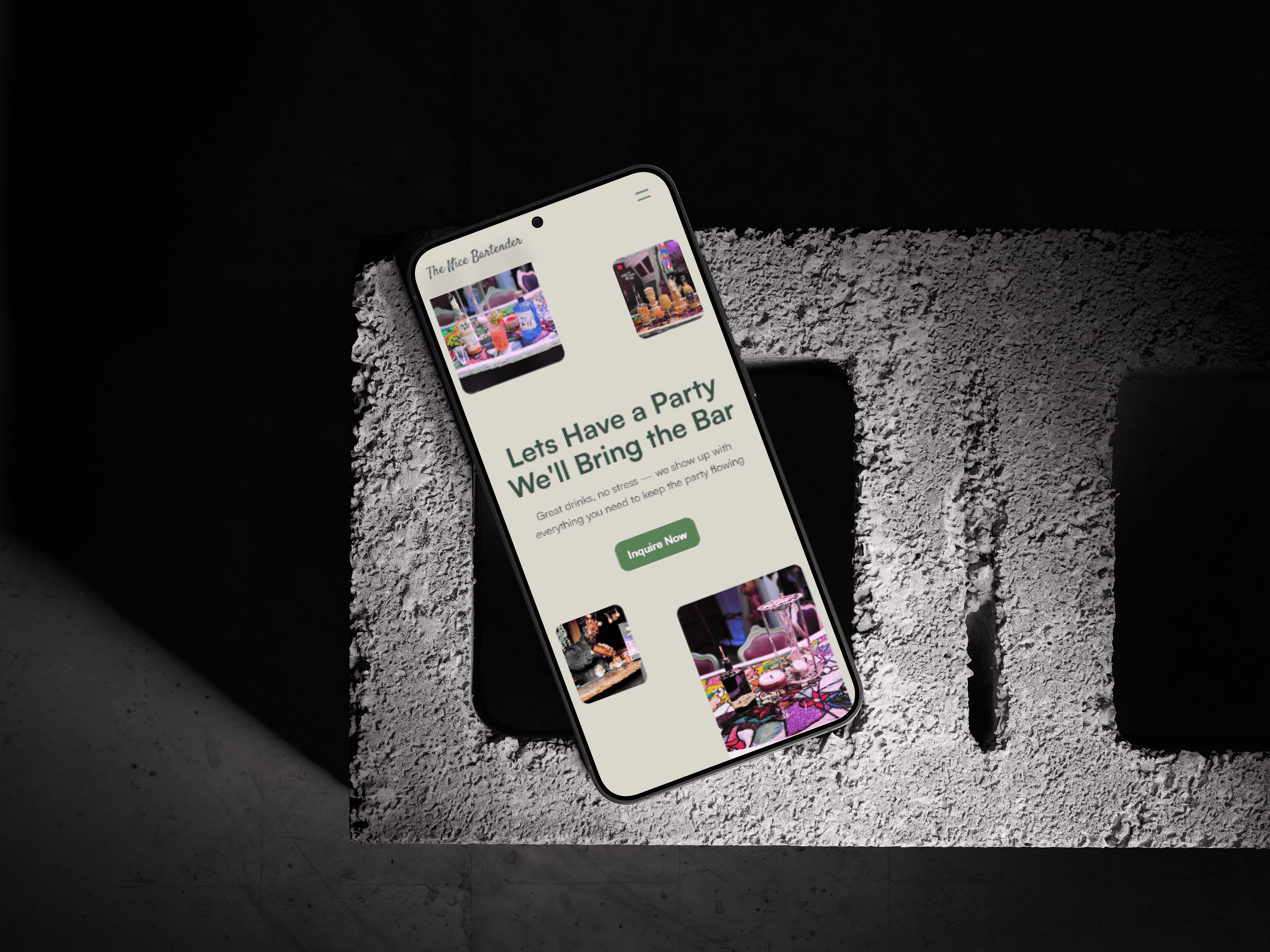
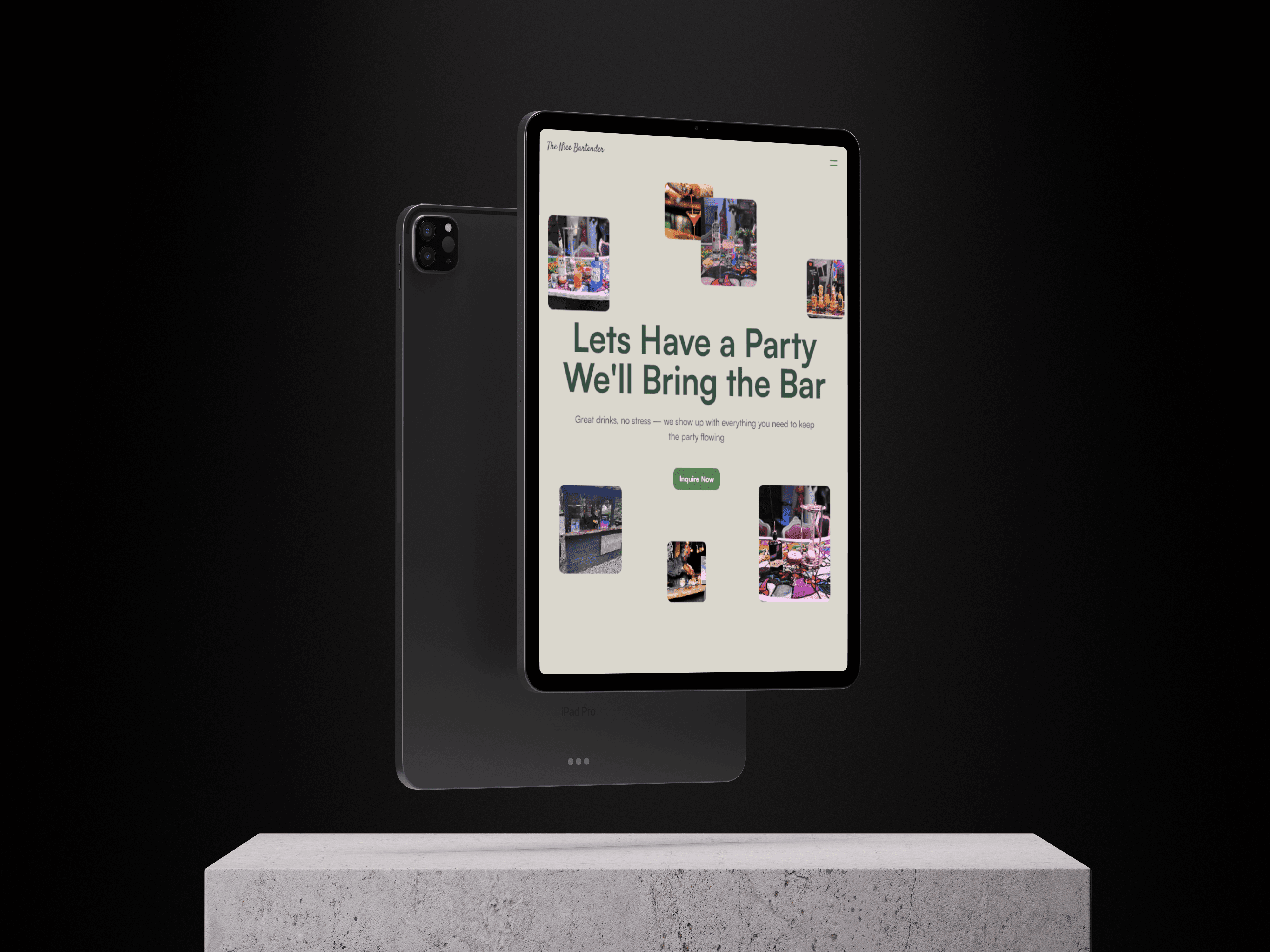
To ensure a frictionless experience, we developed a simple one-page website structure that prioritizes the most important information and user actions. The layout flows logically from introduction to inquiry:
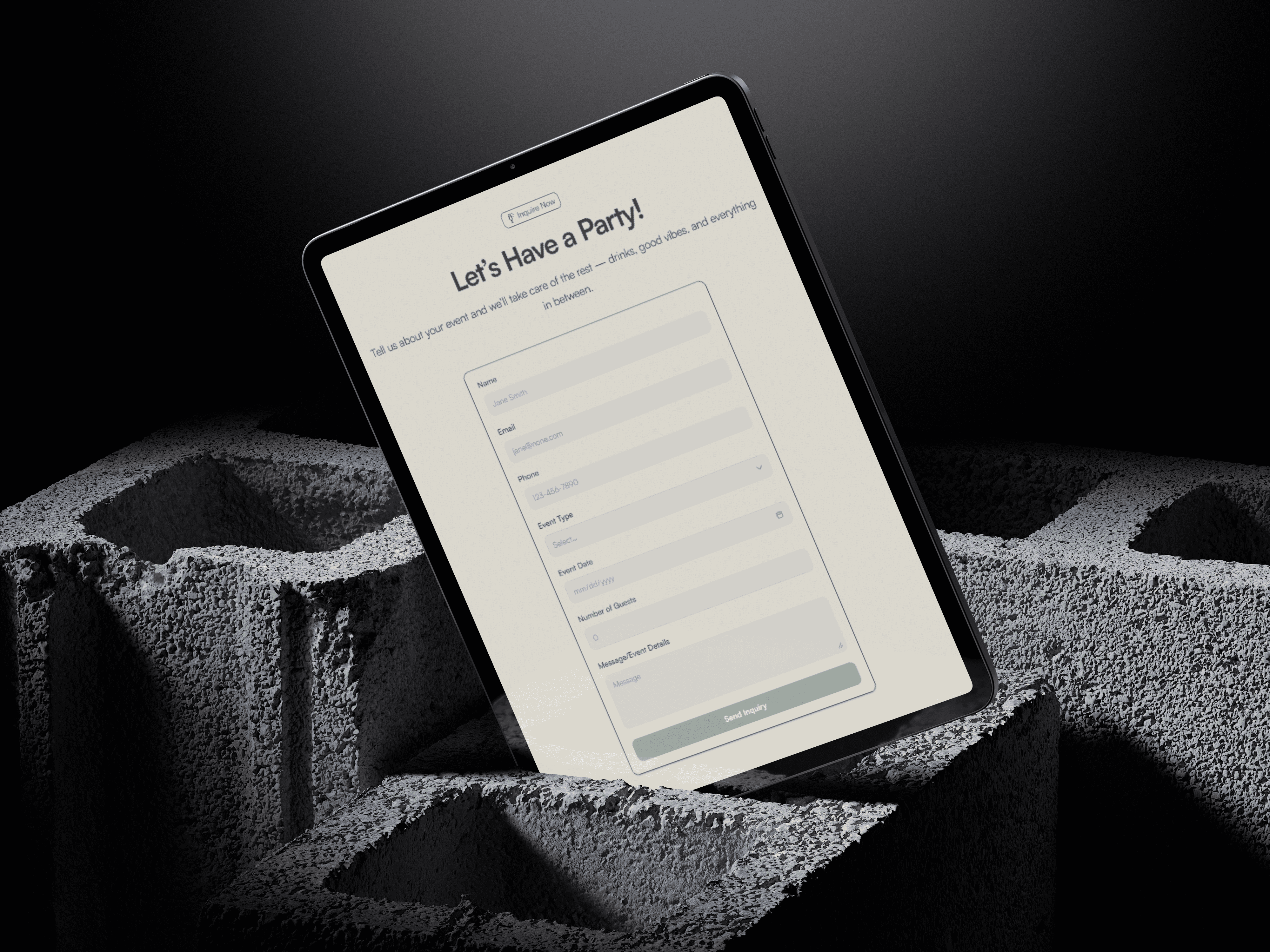
Hero Section – Brand intro, CTA (Inquire Now).
About – Brief brand story and mission.
Services – Clear list of bartending packages with pricing tiers.
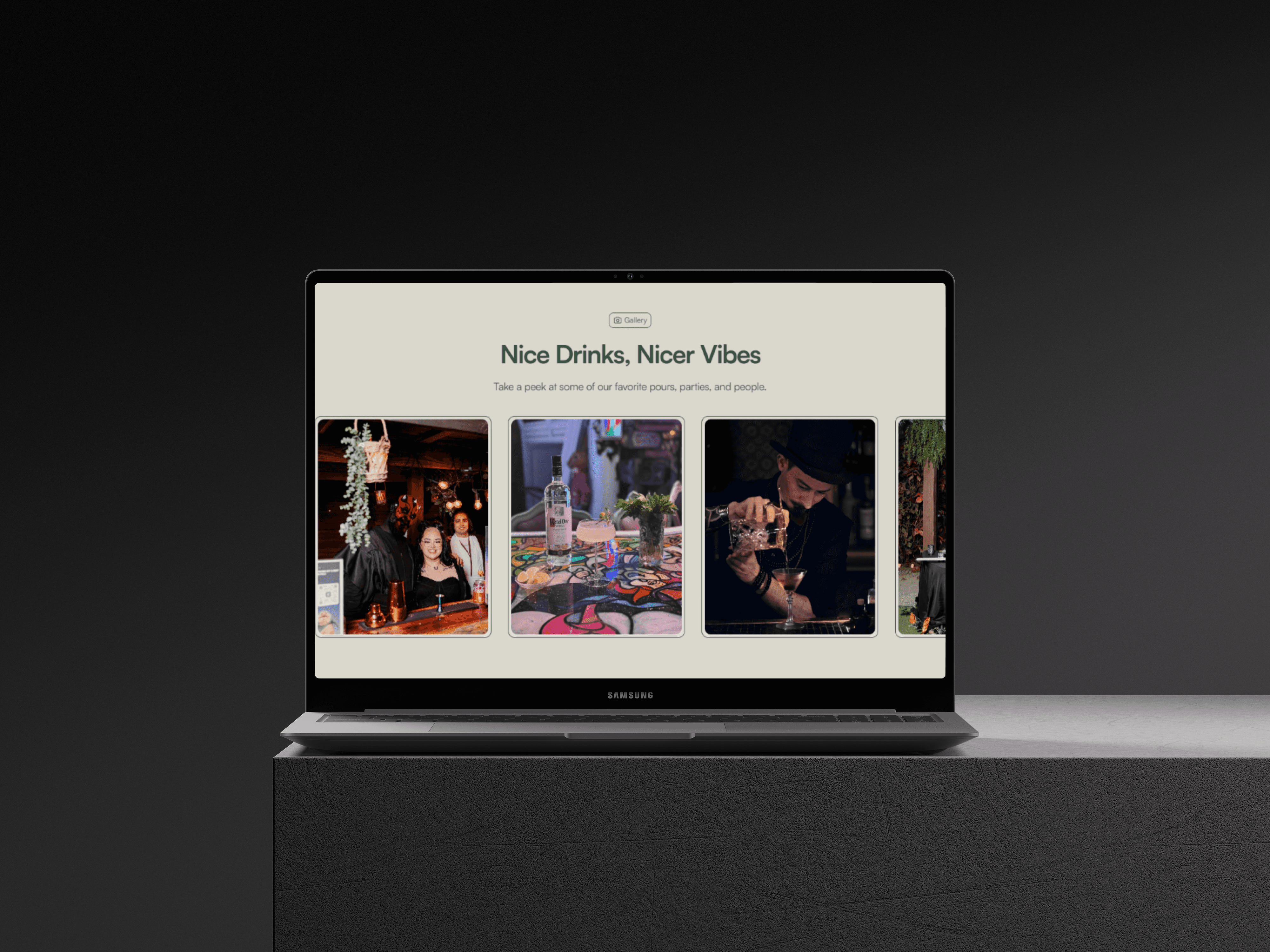
Gallery – Photo highlights of past events to establish trust.
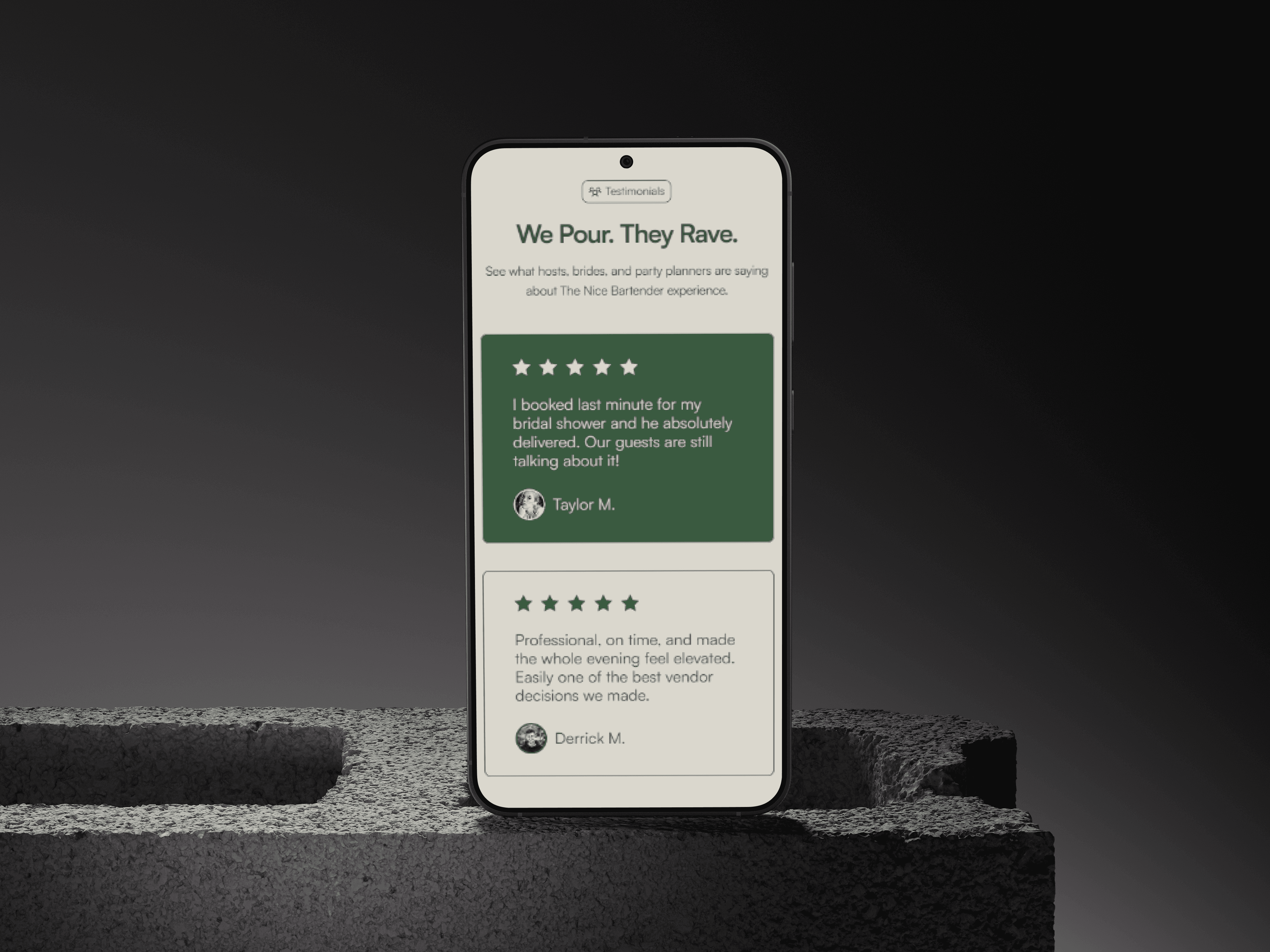
Testimonials – Real client reviews with navigation controls.
Contact/Inquire – Sticky CTA plus an anchored "Inquire Now" section.
This structure reflects typical user behavior: they land on the page, validate the service, scan for pricing or past work, and then decide to inquire.
Color Palette
We chose a warm, inviting palette that communicates both professionalism and celebration. The brand leans into natural, earthy tones while keeping a slight edge of luxury.
Typography
We established a clear hierarchy to maintain visual consistency and guide users through content.
I chose Satoshi, a clean and modern sans-serif typeface, for its geometric simplicity and readability across devices. Its neutral style fits the elegant yet approachable tone of The Nice Bartender brand.
To add personality and a handcrafted feel, I used Satisfy, a script font, exclusively for the logo. Its elegant, flowing style brings a warm and welcoming tone that pairs well with the clean geometry of Satoshi. This contrast helps differentiate the logo while maintaining brand cohesion.
Style | Desktop | Tablet | Mobile |
|---|---|---|---|
H1 | 100px | 80px | 40px |
H2 | 48px | 48px | 32px |
Paragraph | 20px | 20px | 16px |
Nav Links | 16px | 16px | 16px |
CTA | 16px | 16px | 16px |
Responsiveness & Accessibility
The layout is fully responsive and tested across all breakpoints. Specific considerations include:
Adjusted padding and font sizes for mobile.
Disabling heavy animations on mobile to prioritize performance.
All images use alt tags, interactive elements use proper ARIA labels.
Sections are wrapped in semantic HTML5 tags (<section>, <nav>, <footer>) for improved a11y and SEO.
Results
With the full website design finalized across desktop, tablet, and mobile, The Nice Bartender is now ready for launch. The new one-page layout clearly communicates the brand’s personality, highlights services, and creates an easy path for users to inquire. While the domain transfer and official launch are still pending, the site is fully prepared to serve as a central hub for the business — aiming to increase visibility, build trust, and streamline client inquiries once it goes live.
Fully Responsive Design
The final site was designed and tested across desktop, tablet, and mobile breakpoints. Each layout preserves hierarchy and clarity, ensuring that users on any device can easily navigate, read, and inquire about services.
Clear CTA Focus
Multiple touchpoints lead to the main “Inquire Now” call-to-action, including one in the header, in the service section, and at the bottom of the page. These are strategically placed to guide the user journey and improve conversion potential.
Visual Brand Identity
The color palette — consisting of earthy greens, off-white and tan — visually reflects the sophistication and approachability of The Nice Bartender. The selected Satoshi font adds a clean, modern tone throughout the experience.
Streamlined Navigation
A simplified nav bar helps users jump to the right section without friction. Navigation was optimized to be minimal yet functional, using anchor links across the one-page layout.
Social Proof Integration
A testimonial quote was added to enhance trust and credibility. Positioned with breathing room and styled for clarity, it provides authentic reassurance for potential clients.
Service & Gallery Showcase
High-quality images and clear service descriptions give users a preview of what to expect. The layout uses a modular design for each package, making it easier to digest and compare.
SEO & Accessibility Setup
SEO-friendly meta tags, alt attributes, section tagging, and consistent heading structure were all implemented in Framer to improve discoverability and accessibility.
View the Live Prototype
While we await the client’s domain transfer and official launch, you can view the live website prototype to explore the full desktop, tablet, and mobile experience.
👉 Visit The Nice Bartender Website (Link will be updated after client domain launch)