Designing a one-page journey that mirrors the artistry behind the brand.
Framing the Story: A Refined One-Page Experience for Artistic Expressions
COMPANY
Artistic Expressions
ROLE
UI/UX Designer
EXPERTISE
UI/UX Design
YEAR
2025

Project
Artistic Expressions Framing is a boutique framing studio known for its personalized, high-quality work—but its original website didn’t reflect that craftsmanship. The outdated, multi-page layout lacked visual cohesion, clear navigation, and emotional resonance, making it difficult for users to understand services or take action.
This project focused on reimagining the site as a single-page experience. I designed a modern, scrollable layout that showcases the studio’s story, services, and portfolio with clarity and elegance—aligning the digital experience with the artistry behind the brand.
Problem
Artistic Expressions Framing, a custom picture framing studio, had a dated multi-page website that failed to communicate its high-end craftsmanship or guide users effectively. The scattered layout made it hard for visitors to understand services, view past work, or get in touch—resulting in missed engagement opportunities.
Process
The design process began with user research to understand how real customers interacted with the original site and what expectations they had when seeking custom framing services. From there, I defined key user pain points and business goals that shaped the core design strategy. Using insights gathered from competitor analysis, I explored a simplified one-page layout that would guide users through the brand’s story, services, and work—all in a seamless scroll. Through wireframing, prototyping, and visual refinement, the new experience evolved into a polished, conversion-focused design.
User Research
I conducted informal interviews with five users—three with experience in custom framing and two unfamiliar with the process. Most users expected a gallery of past work, clear service offerings, and an easy way to request quotes. Instead, they found the original site visually outdated and structurally fragmented. Users expressed confusion about where to begin and noted that the site didn’t reflect the high-end, handcrafted nature of the business. These insights validated the need for a streamlined, emotionally engaging experience.
Stakeholder Goals
While no formal client was involved, the implied goals of a boutique framing shop like Artistic Expressions are clear: showcase craftsmanship, build trust, and drive more inquiries or in-store visits. The one-page layout was designed with these goals in mind—highlighting the business’s story, displaying work in an elegant gallery, and placing calls-to-action in strategic, non-intrusive spots throughout the scroll. A contact section at the bottom creates a natural endpoint that encourages users to convert.
Identified Pain Points
From both user feedback and heuristic evaluation of the original site, several pain points emerged:
Lack of visual hierarchy or clear paths to action
No portfolio or service breakdown on the homepage
Minimal emotional connection to the brand
Frustrating navigation across multiple disconnected pages
These issues made it difficult for users to engage or feel confident in the quality of service.
Competitive/Industry Analysis
I reviewed five other high-end framing websites and noticed consistent patterns among successful ones: full-width visuals, strong use of testimonials, simplified one-page navigation, and personalized storytelling. These sites balanced aesthetic appeal with clarity, often emphasizing emotional connections and craft. This analysis strongly informed the new layout—ensuring the Artistic Expressions redesign aligned with modern expectations while differentiating through its boutique, intimate tone.
Solution
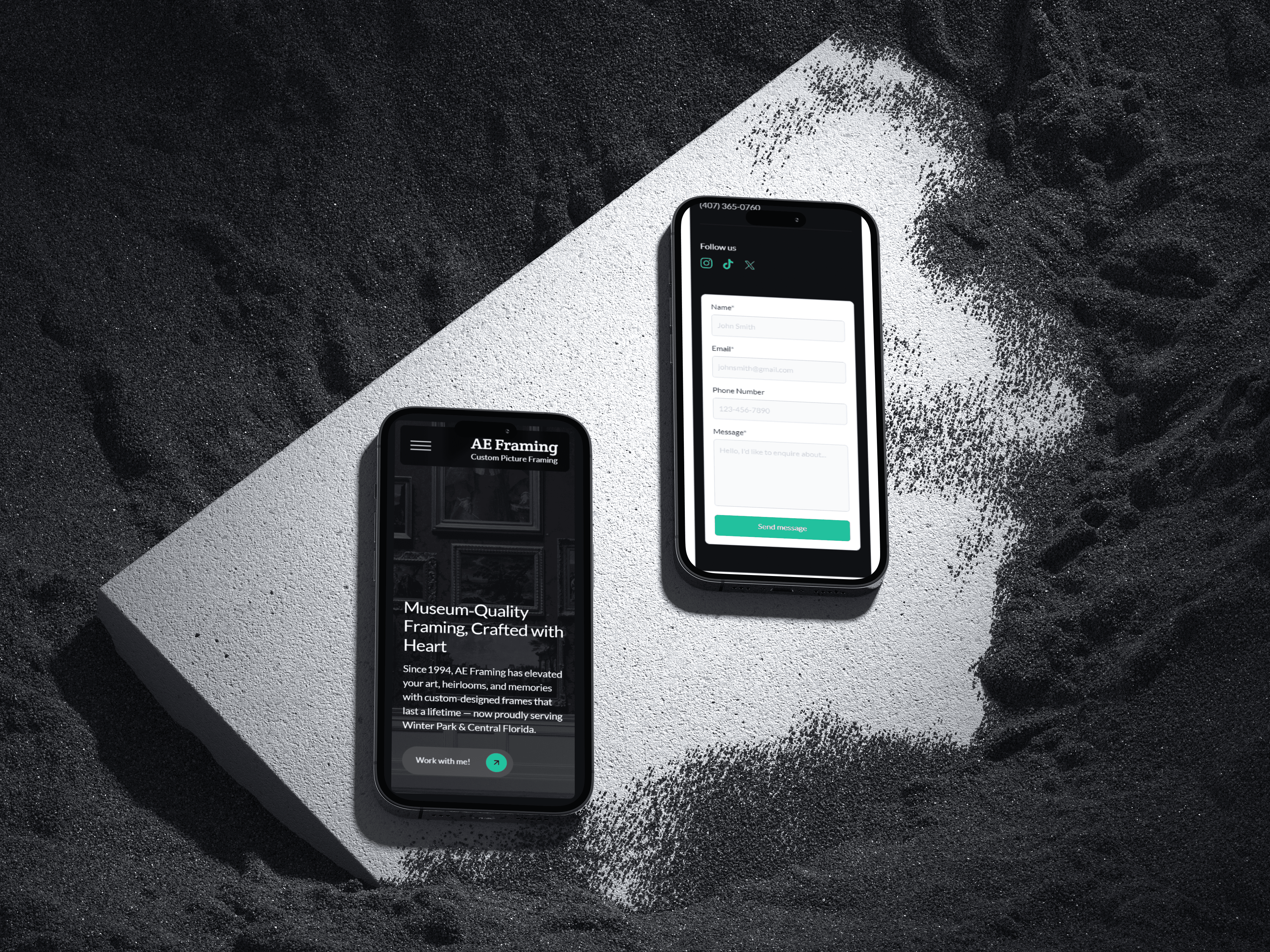
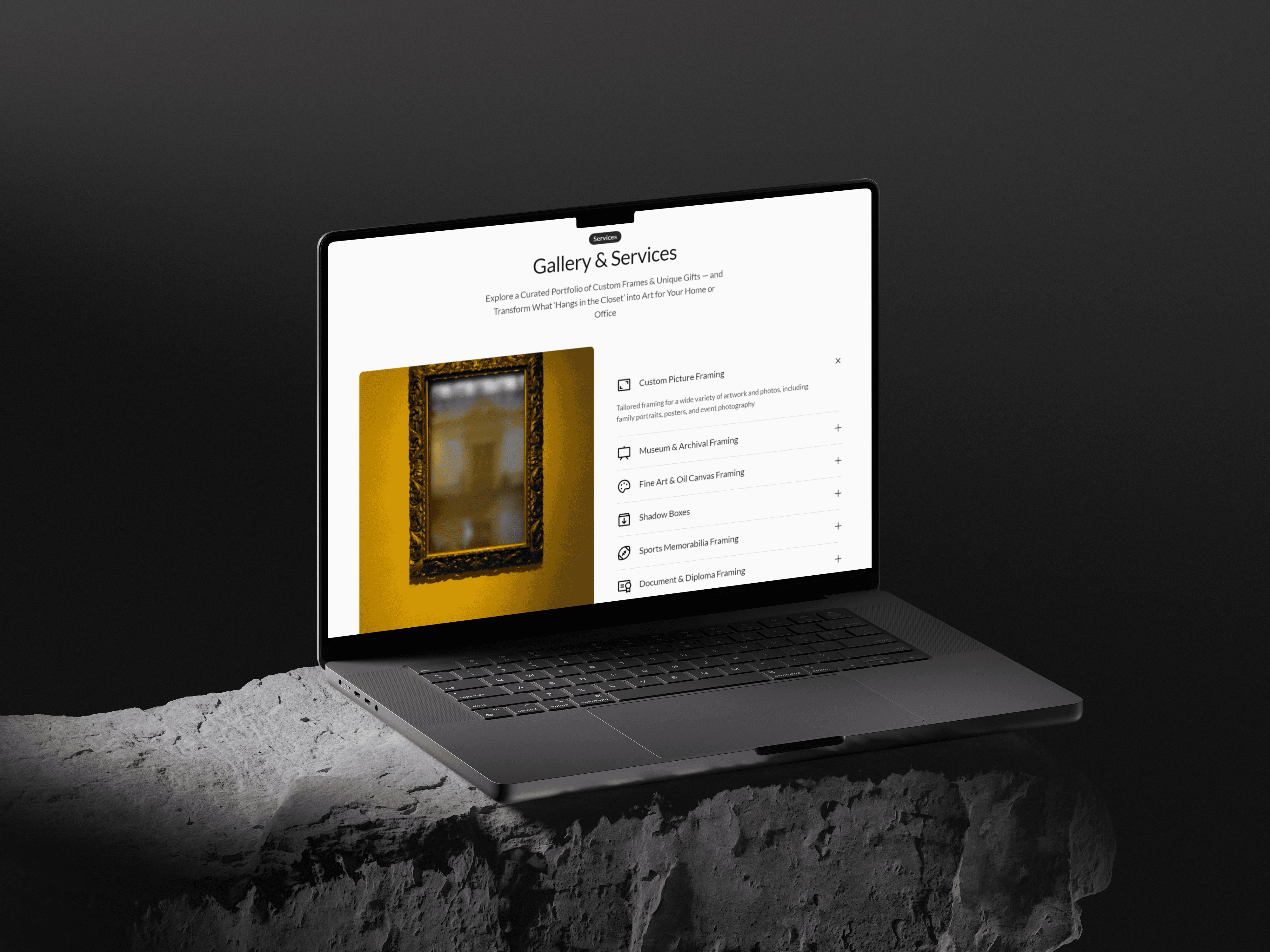
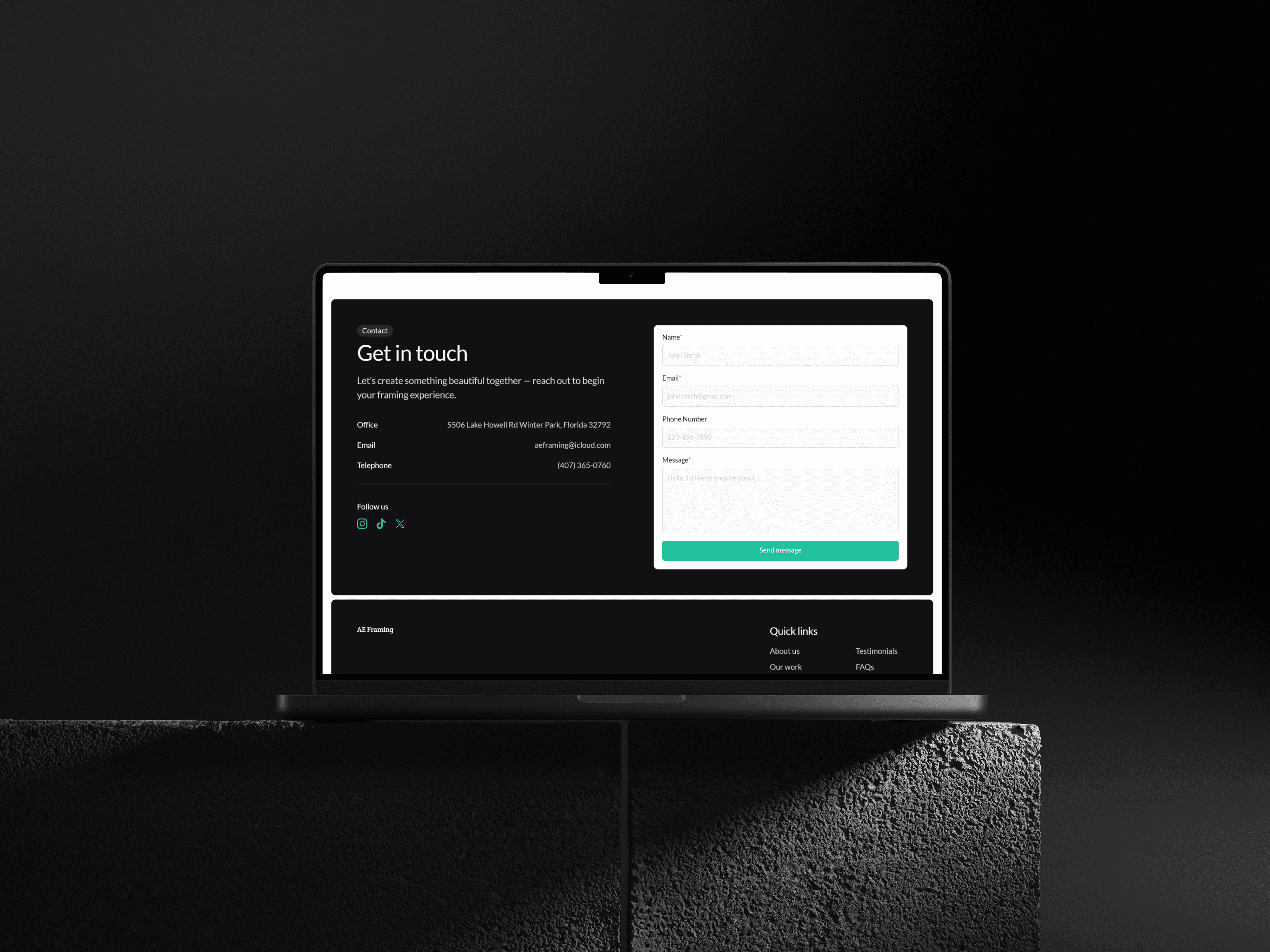
To address the fragmented and outdated experience of the original website, I designed a modern one-page layout that tells the brand’s story from top to bottom. This new structure simplifies the user journey by presenting all key content—introduction, gallery, services, testimonials, FAQs, and contact—in a seamless scroll. Strategic use of visual hierarchy, strong imagery, and well-placed calls-to-action ensures users are guided intuitively through the site. The final design reflects the artistic quality of the brand while making it easier for users to explore, trust, and connect.
Key Research-Driven Solution
Although the original site included imagery of past work, users found it buried and disconnected from the flow of information. In the new design, visual proof of craftsmanship is featured more prominently within a clear, scrollable structure—integrated alongside services, testimonials, and contact prompts.
By streamlining content and emphasizing storytelling, the solution delivers a refined user journey that builds trust, encourages engagement, and reflects the quality of the brand’s work.
Solution to Stakeholder Goals
To support the business’s underlying goals—showcasing craftsmanship, building trust, and driving inquiries—the new design focuses on creating an intentional, story-driven experience. The one-page layout allows users to absorb the brand’s value proposition without friction, featuring an elegant gallery that highlights past work, embedded testimonials for credibility, and soft yet visible calls-to-action.
By placing the contact form at the natural end of the scroll and aligning content with the customer journey, the design encourages conversion while respecting the boutique brand’s refined tone.
Pain Points - Practical Solutions
To resolve the lack of visual hierarchy and fragmented navigation, I restructured the experience into a thoughtfully sequenced format where each section builds naturally on the last. Key content areas—such as the introduction, visual portfolio, service breakdowns, and testimonials—were given clear visual weight and spacing, making the journey intuitive and digestible without overwhelming the user.
To bridge the emotional gap, I focused on integrating storytelling, high-impact imagery, and authentic client quotes. These elements work together to convey the studio’s craftsmanship and personality, helping visitors feel connected and confident from the start.
Solution to Competitive Analysis
Insights from leading framing websites heavily influenced the final design. By adopting industry-standard patterns—such as full-width visuals, embedded testimonials, and single-page navigation—I ensured the site met user expectations for both usability and style. However, to preserve the intimate, boutique feel of Artistic Expressions, the layout was softened with warm imagery, personal storytelling, and curated content pacing.
The result is a design that aligns with modern trends while differentiating through tone, authenticity, and handcrafted personality—effectively standing out in a saturated digital space.

Results
The final design successfully addressed the key challenges identified in the original site. By simplifying the user journey, highlighting the brand’s strengths, and improving visual communication, the new experience feels more aligned with the studio’s identity and customer expectations. While this project didn’t include live analytics, the design is built to increase user engagement, improve clarity, and encourage conversions through better structure, storytelling, and usability.
Although the redesigned site has not yet launched publicly or been measured with live analytics, the outcome reflects strong UX principles and user-centered thinking:
Improved Clarity: Users now encounter a clear, structured flow—making it easier to understand services, view work, and reach out without unnecessary clicks or confusion.
Stronger Engagement Potential: Testimonials, portfolio visuals, and emotional storytelling are now integrated into the experience, creating stronger emotional resonance and user confidence.
Streamlined Navigation: The disconnected navigation from the original site was replaced with a seamless, section-based experience—reducing friction and improving overall usability.
Brand Alignment: The design now visually reflects the boutique and artistic nature of the business, aligning digital presence with real-world craftsmanship.
Client Readiness: The structure is set up to support future growth, including easier content updates, SEO optimization, and integration of analytics tools for measuring engagement and conversion.
The redesigned site is currently live on Framer while the client prepares to transfer their custom domain.
👉 View the prototype
For comparison, the original website can be viewed here:
👉 Original site: artisticexpressionsframing.com
Note: At the time of this case study, the client had not yet provided final assets such as imagery, logo files, or testimonial content. High-quality placeholder images from Unsplash and sample text were used to represent the intended tone and structure of the final experience. These elements will be updated once the client delivers finalized content.